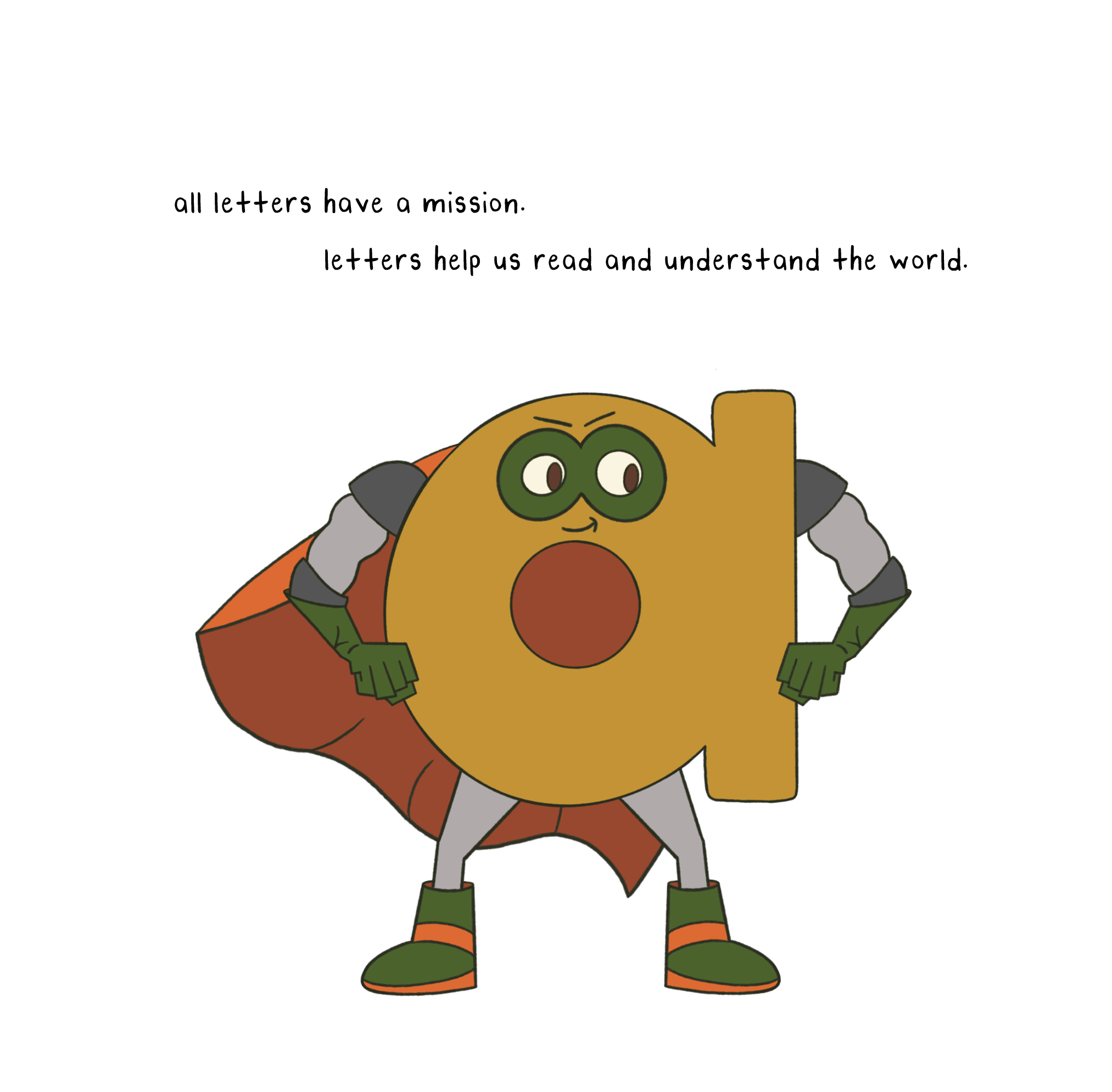
 Image 1 of 1
Ivanna Perez
letra
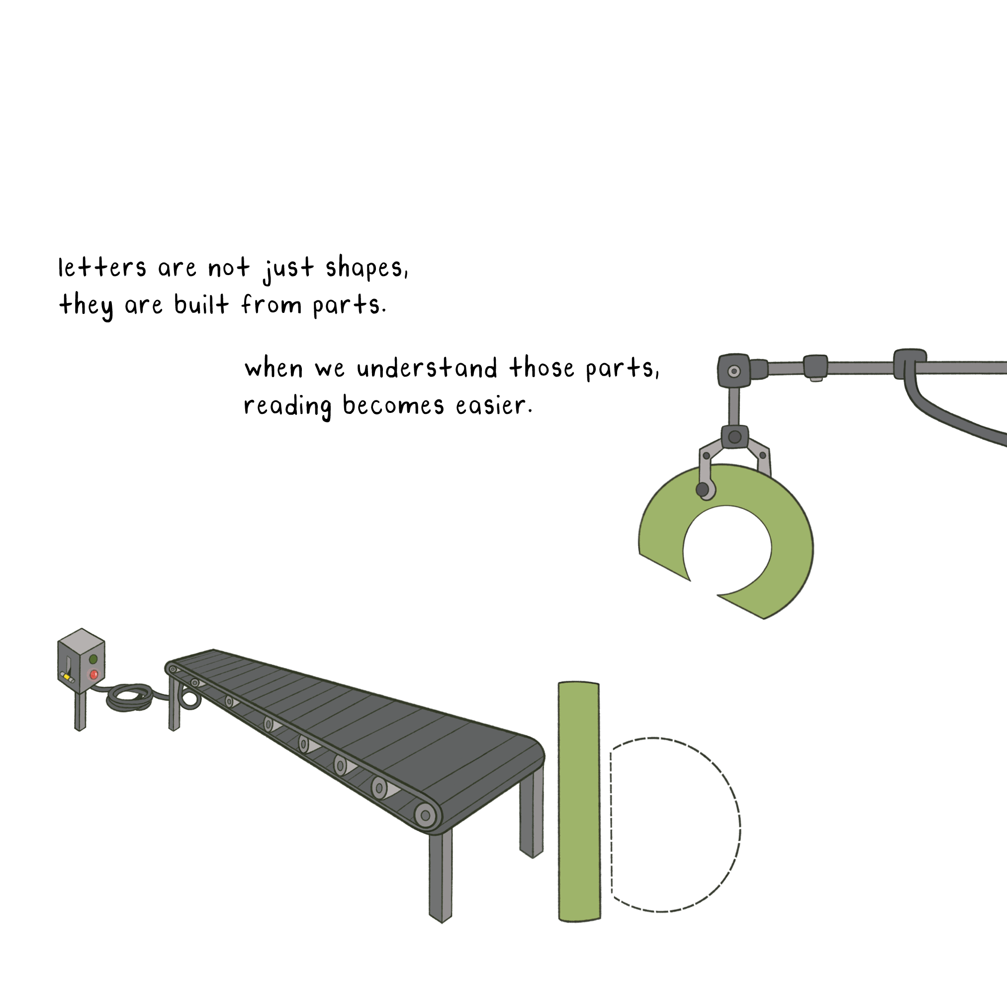
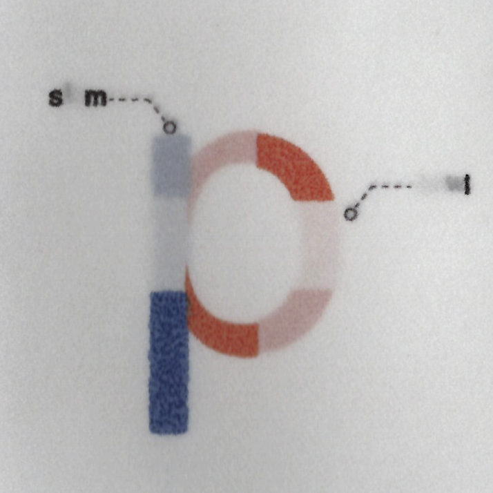
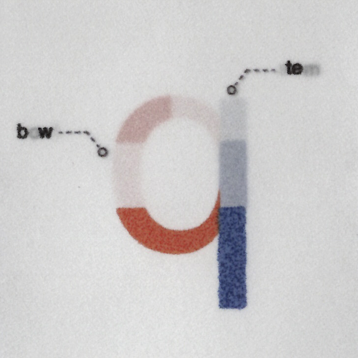
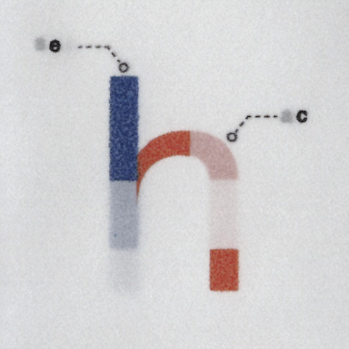
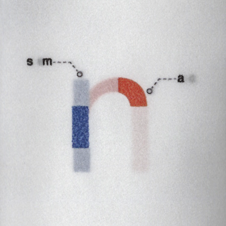
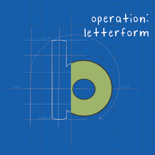
letra is an interactive literacy system that reimagines how children understand lowercase letterforms through construction, material, and play. Grounded in research on multisensory learning, phonemic awareness, and embodied cognition, this project reinvents the way children are first introduced to reading and writing through lowercase letterforms. Rather than treating lowercase letters as static symbols to be memorized, letra proposes that these letters are systems of parts: stems, bowls, and arcs.
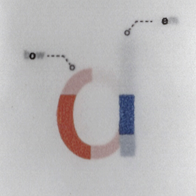
These parts can be explored, manipulated, and reconstructed. Through a combination of a narrative publication and a modular acrylic artifact, children are invited to physically assemble letterforms and discover relationships between commonly confused pairs such as b/d, p/q, and h/n. The letter parts are differentiated through a consistent color system: blue for stems and orange for bowls/arcs. These are complementary colors that reinforce contrast, support pattern recognition, and aid memory through association. Additionally, transparent layers, overlapping forms, and illustrated diagrams create moments of revelation in which lowercase letters shift from confusion to clarity.
This project is a harmonious pairing of analog and digital thinking. While rooted in tactile, hands-on engagement, it embraces precision, modularity, and systematic design often associated with digital environments. The result is a hybrid learning experience that supports autonomy, reinforces structural understanding, and builds confidence in early readers.
Rather than asking children to memorize lowercase letters, letra invites them to understand how lowercase letters are constructed, and simultaneously, how reading itself is built.
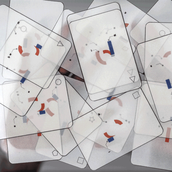
Modular panels separate letterforms into fundamental parts. Each piece functions independently, while overlapping layers form recognizable structures, encouraging children to explore how letters are constructed through alignment and interaction.
Layered transparency reveals how individual components combine to form complete letterforms. As panels overlap, clarity emerges, encouraging active problem-solving and reinforcing recognition through reconstruction.
A narrative introduction that places letters within the everyday environment. Environmental typography encourages children to observe, question, and recognize familiar forms in real-world contexts.